TXVacation has a strong following of young men and women on social media who love their recommendations that they post. TXVacations’ social posts and bio link to their website where they sell more in-depth digital travel guides, but they need help driving sales of the guides and showing their value. They also partner with businesses in Texas that they post about or include in their guides, however, they do not have an online process for businesses to reach out about partnerships.
Outcome
We focused on completely redesigning the mobile website since most of their traffic is coming in through their social media pages. By making the site much more intuitive and clear what the product is, we feel that alone will help drive sales (along with other features and designs as well). We also moved their business partnerships pdf to be a contact page on the site.
Solution
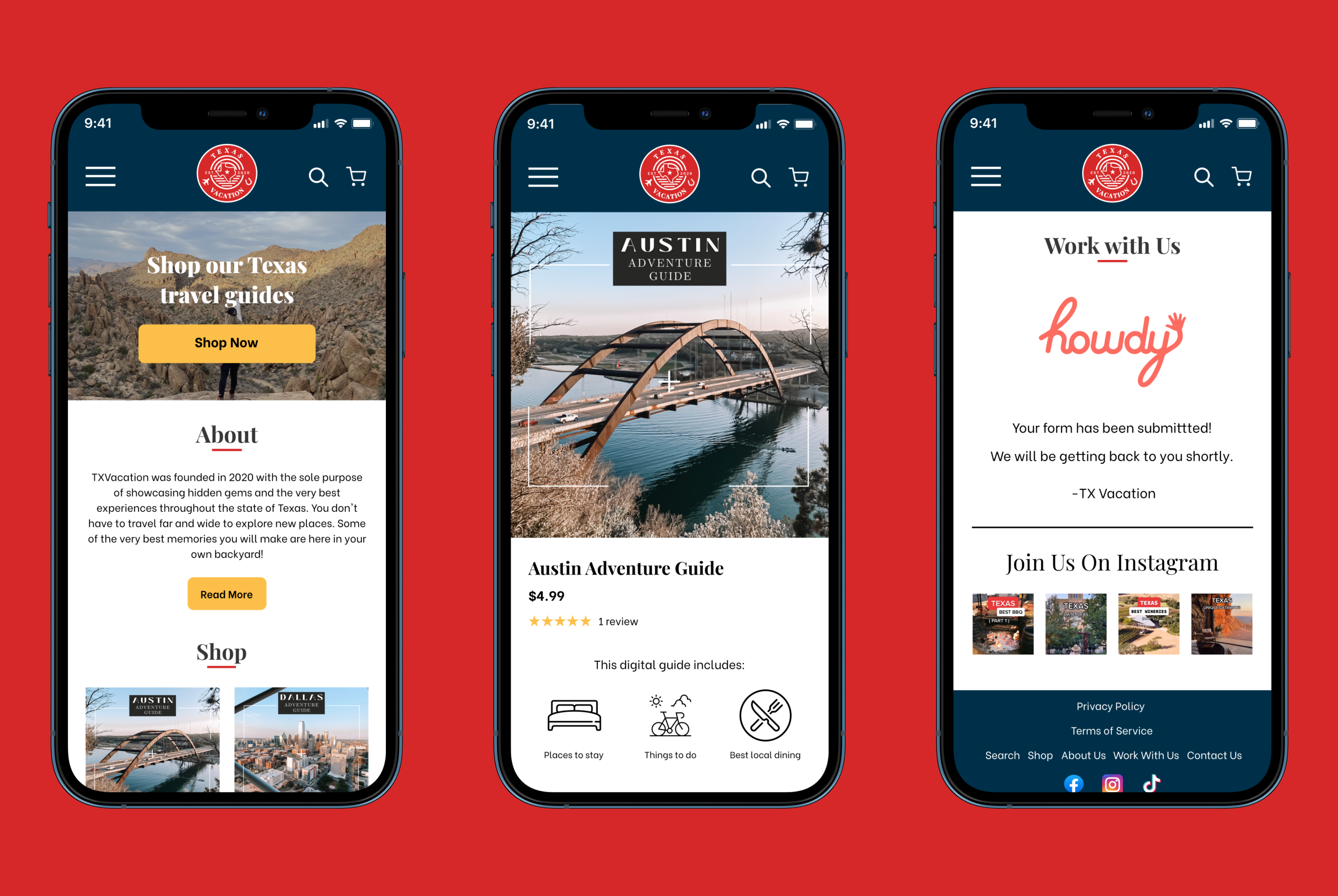
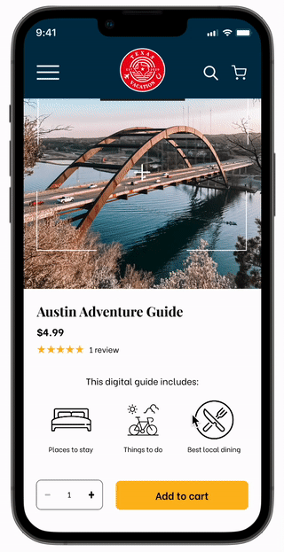
The main goal of the project was to drive sales of their travel guides. By adding writing that tells the customer that this site sells travel guides AND with a large CTA button all right at the top of the screen to shop, it clearly shows the primary use of this page. The shopper doesn’t have to scroll far to see some products listed out as well and begin shopping.
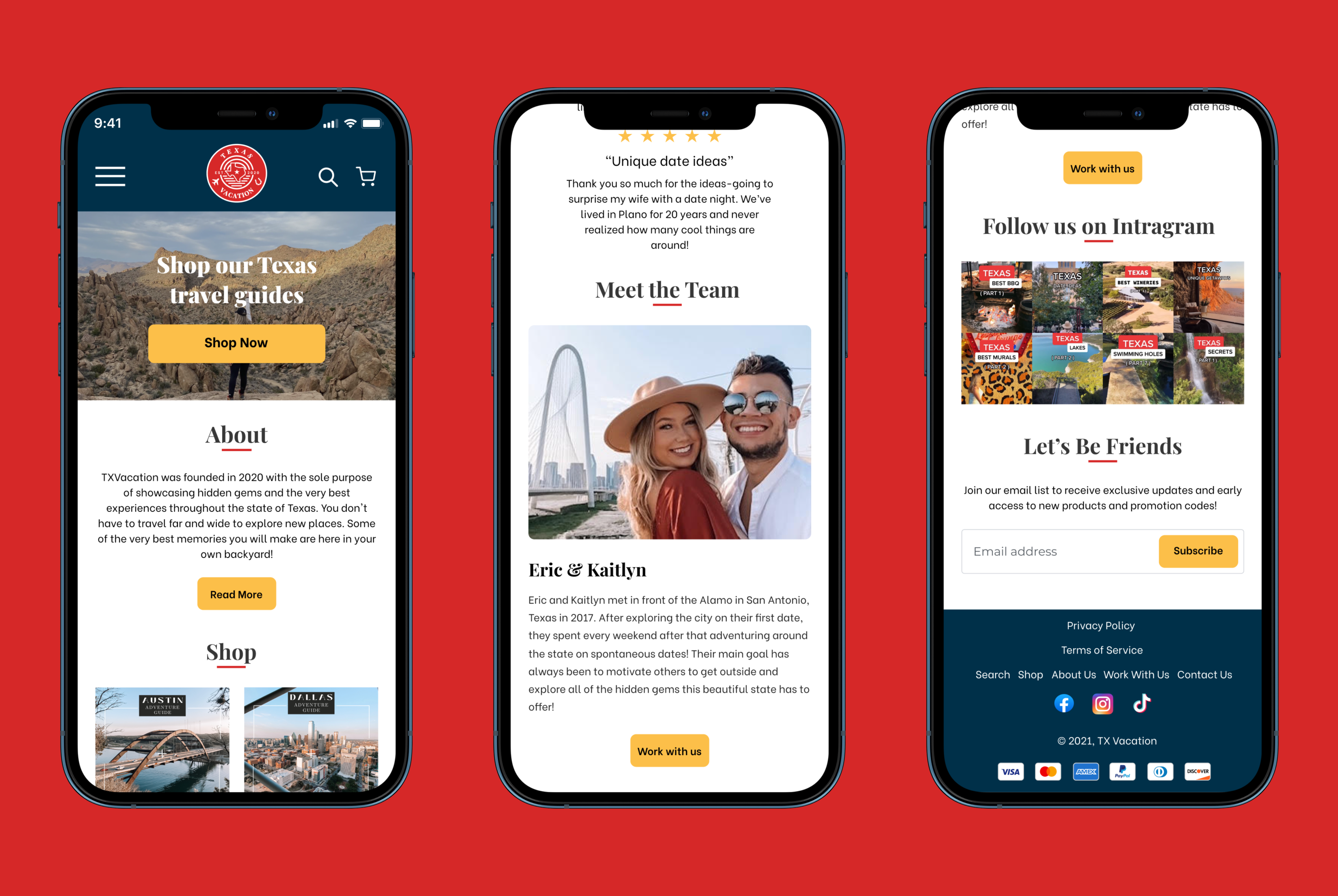
We also thought it would be important to really sell the value of the travel guides and build brand trust by highlighting testimonials on the home page.
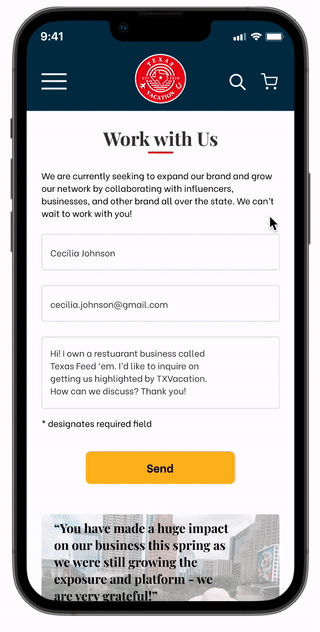
By adding a face to the name in the form of a “Meet the Team” can help the shopper build trust in brand and can make them feel more motivated to support a local or small business. Underneath that, I added the “Work with us” button which leads to the business partnerships page.
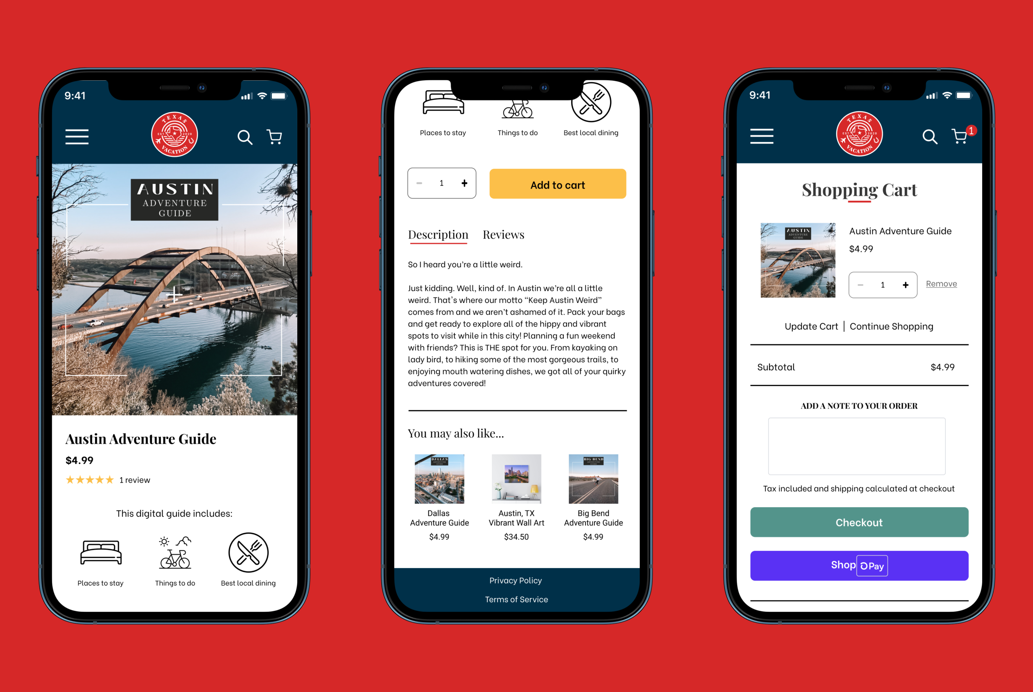
It wasn’t particularly clear what the product was before and all the information was buried at the bottom of the description. So I added these icons so customers can understand right off the bat what the guide includes AND that it is a digital guide. I also made the main call to action button yellow to stand out a bit more. The shopping cart is consistent with the Shopify checkout process, so the user will be already be familiar with this pattern.
How exactly did I get here?
Read on for the full process ⬇
Research
Goal: Build an understanding of the industry and identify needs
Survey Says...
We had a solid understanding of who TXVacation’s main audience was due to their analytics that they shared with us. However, we wanted to find out more on how that target audience goes about planning trips and what they value most while searching for their next adventure. So, we conducted surveys using their target audience and found a couple recurring frustrations.
•It takes a lot of time to filter through all of the tourist trap recommendations and find the unique and worthwhile experiences.
•Most travelers value authentic and unique experiences.
So, what do we need to figure out?
Travelers need a quick yet high quality way of planning their upcoming Texas trip so they can find where to dine, shop and discover hidden gems.
TXVacation needs an improved website, so that they can showcase their products, connect with businesses, and effectively provide high quality recommendations to their community.
Branding Decisions
Test & Develop
Goal: Facilitate usability testing and iterate.
Usability Testing
We thought our redesign was heading in the right direction, but is it intuitive enough? Is it clear what the product is and how to purchase it? We relied on one round of eight usability tests that used both qualitative and quantitative metrics to determine success.
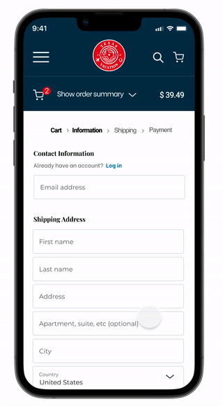
Users weren’t sure if something was added to their cart when they clicked the button, so we made sure to make that feedback clear in the mockup.
Users had a hard time finding the work with us page as it was listed in the hamburger menu as “Business Inquiries”. Once they did find it, they weren’t sure what the purpose of this page actually was. So, we changed the name of the page and added in important content from TXVacation’s business partnerships pdf to the online page and form.
Users were familiar with this Shopify checkout process, but felt something was off. So, I made the prototype simulate actual typing, cleaned up the form field boxes, and even threw in an error state to make it feel more realistic.
Next Steps & Reflection
These were the next steps that I recommended to the stakeholders:
Make these mocked up designs for the desktop experience
Change the Shopify theme to “Showcase” in order to match these designs
I’d recommend working with a developer after that is complete, to help achieve the remaining aspects of the design that are not included in the theme
I learned so much working on this project, namely some cool prototyping tricks, the power of interactive components, and the importance of proper spacing.
Looking back, I wish we had done another round of usability testing on the almost mocked up designs. In my opinion, more feedback only helps and never hurts! I also would have taken a few more risks in the design and made certain elements more quirky and fun. The client wanted clean but also told us to have some fun, so I think we could have been more bold. However, they loved the final designs so I could be overthinking (as we designers tend to do) 😉.
Let's Chat!
Have questions about my work? Want to learn more about what motivates me?