
Lesley really went above and beyond to push our group into a higher gear. When there was something that needed to be done, Lesley was ready for the action. She excelled so well at synthesizing data for our team and used that data to push design decisions to the next level. On top of that, her organizational skills were out of this world and really made the visual design of our product all come into fruition.

Working with Lesley was wonderful. She takes initiative and makes sure nothing slips through the cracks. She kept our team organized and on track throughout our entire project, and was a voice of reason when important decisions needed to be made.
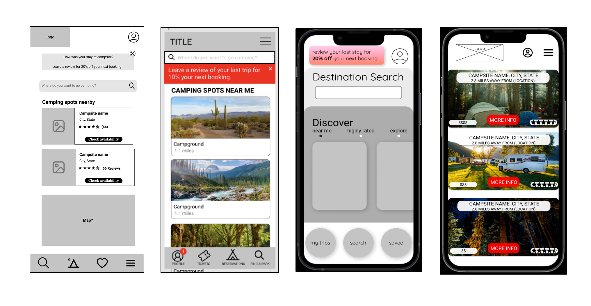
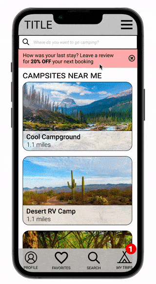
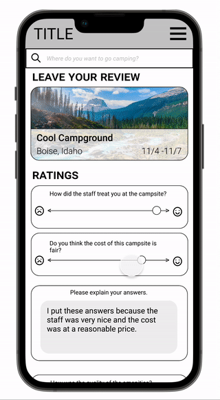
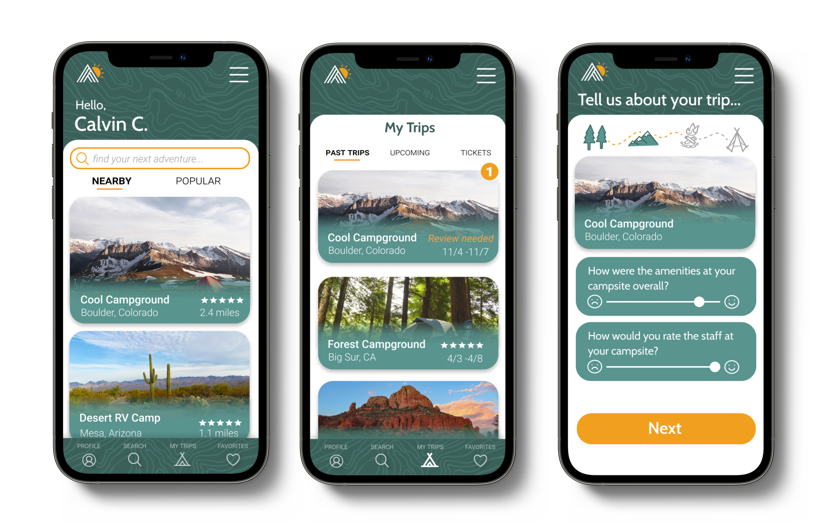
Lesley brought some great ideas to this project, and used data we had gathered to specifically focus on creating a streamlined product page for the app. Her willingness to make collaborative decisions helped this project to run smoothly and her attention to detail was unmatched amongst the team. We relied on Lesley to contribute thoughtful insight and analysis of our research, especially after the usability testing, and she did not let us down. 100% would recommend!